Major League Soccer Unveils New Logo
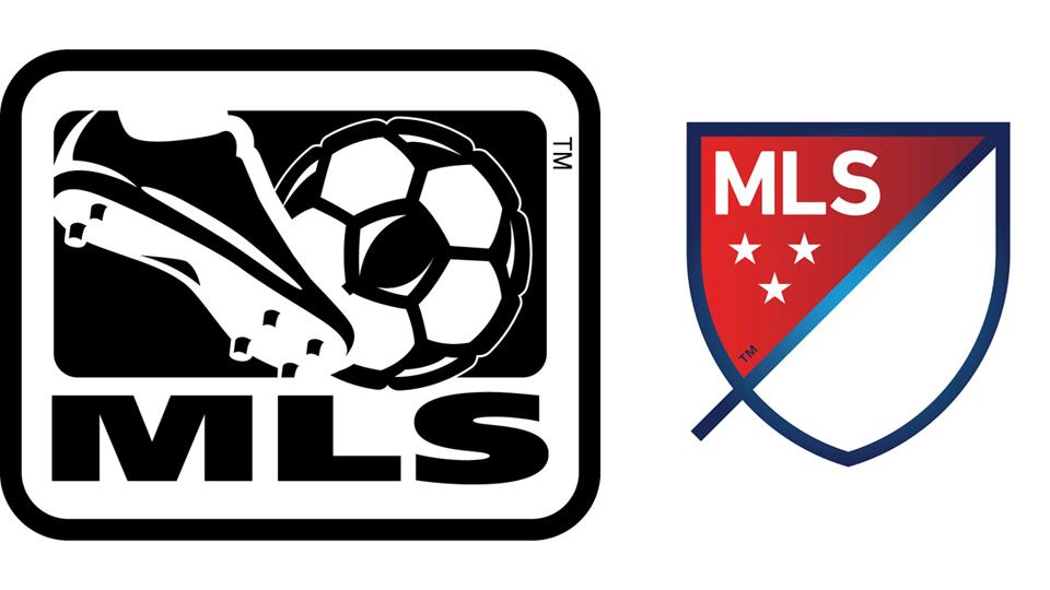

On Thursday, Major League Soccer (MLS) unveiled a new logo for the first time in its 15 years history. Gone is the cliche soccer ball and boot. In their place is a refined shield/crest design with the words “MLS”, a series of three stars, and customizable color schemes for each team in the league. The three stars represent “Community, Club, Country”–the newly-established tenets of the MLS. There is also a 45 degree horizontal line that bisects and extends outside the crest and represents the two 45 minute halves of a match and; according to the MLS website, refers “to soccer’s speed and energy.”
“The new brand’s design is intended to say “soccer” without the literal ball and cleat,” reads a press release on the MLS website, part of their “Next” rollout. “In the end, we decided that the inclusion of a ball and cleat is unnecessary as it dates us very quickly (due to the fast pace of innovation in our game) while many other ways exist to signal we are a soccer league. Our new brand will build meaning over time so that our new crest signifies soccer in North America and has a unique place in global sports.”
Personally, I feel like the new identity is rather bland and doesn’t capture the dynamic nature of America’s fastest growing professional sports league. As a graphic designer, I think that brand identities should be refreshed and/or re-designed with frequency, but only if the new mark is an upgrade over the previous version. A good logo; like design, creates further interest and makes the viewer want to know more about the mark. In my humble opinion, the new MLS logo fails to create this interest. Recent redesigns like AirBnB and Yahoo come to mind when thinking about new logos that are not better than the original. One positive element about the new logo is its simplicity lends itself for viewing online, on mobile and tablet devices far better than the original mark.
What do you think about this logo re-brand? Is it better than the original? Leave your thoughts below.